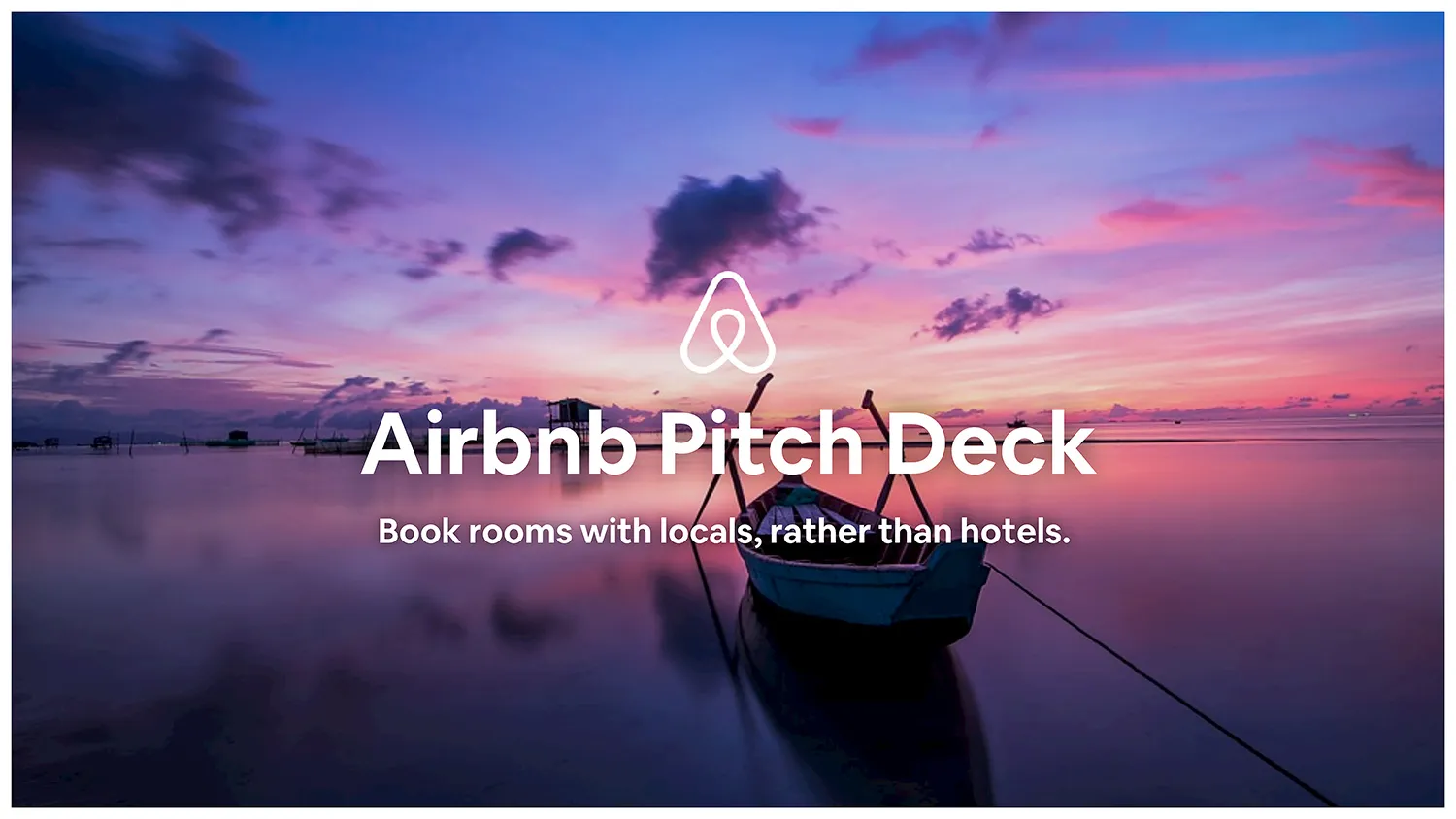
Airbnb Pitch Deck
Airbnb is a platform that allows people to list, find, and rent lodging. This company is one of the greatest startup success stories of our time. Even with an attractive business plan and fantastic traction initially, the travel startup still had to pitch their company to potential investors. This 2009 Airbnb pitch deck presentation landed them $600,000 in seed funding.
The Airbnb pitch deck has become a favorite reference for entrepreneurs around the world. This deck exemplifies simplicity at its finest. Each slide is relatively basic, presenting the information quickly and efficiently. To show how Beautiful.ai’s presentation templates can help you with your pitch deck, we gave the Airbnb pitch deck a design refresh.
Breakdown of Airbnb Pitch Deck Slides
A well-designed pitch deck template can seal the deal for the growth of your project or startup. It's important to craft a document worthy of attention to achieve your goals. Like we did for our Airbnb pitch deck redesign, make use of visually compelling graphics like Venn diagrams, a SWOT analysis, images, and more. Using Beautiful.ai, you can add all of these elements with just one click. Here are some slides you could include:
Pro Tips for Creating Successful Pitch Decks
Along with our Airbnb pitch deck refresh, we’ve taken cues from other top startups who’ve raised money from angel investors and VCs with effective pitch decks. Here are tips for customizing your own pitch deck template:
A pitch deck should be clear, compelling, and straightforward. About 10 to 20 slides should be enough to hit all the key points.
The overall layout of your slideshow is important, but each slide template also needs to make an impact. Capitalization, bolding key messages, and adding color will create attention on each individual slide.
Charts, funnels, graphs, and images all add to the way your presentation is received. Visual aids make slides memorable and draw notice from your audience to important components.
Your presentation should support what you’re saying, not distract from it. Keep your design and text simple.


