
Data visualization built for presentations
Turn a spreadsheet into clear, compelling, and impressive visuals. Standardize data storytelling across your organization. Beautiful.ai gives you a complete library of data slides; charts, graphs, timelines, diagrams, and more, to structure your story.


How to bring data to life, beautifully
From spreadsheets to standout slides in minutes.
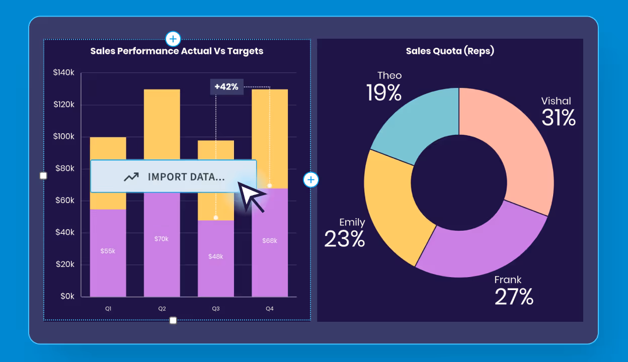
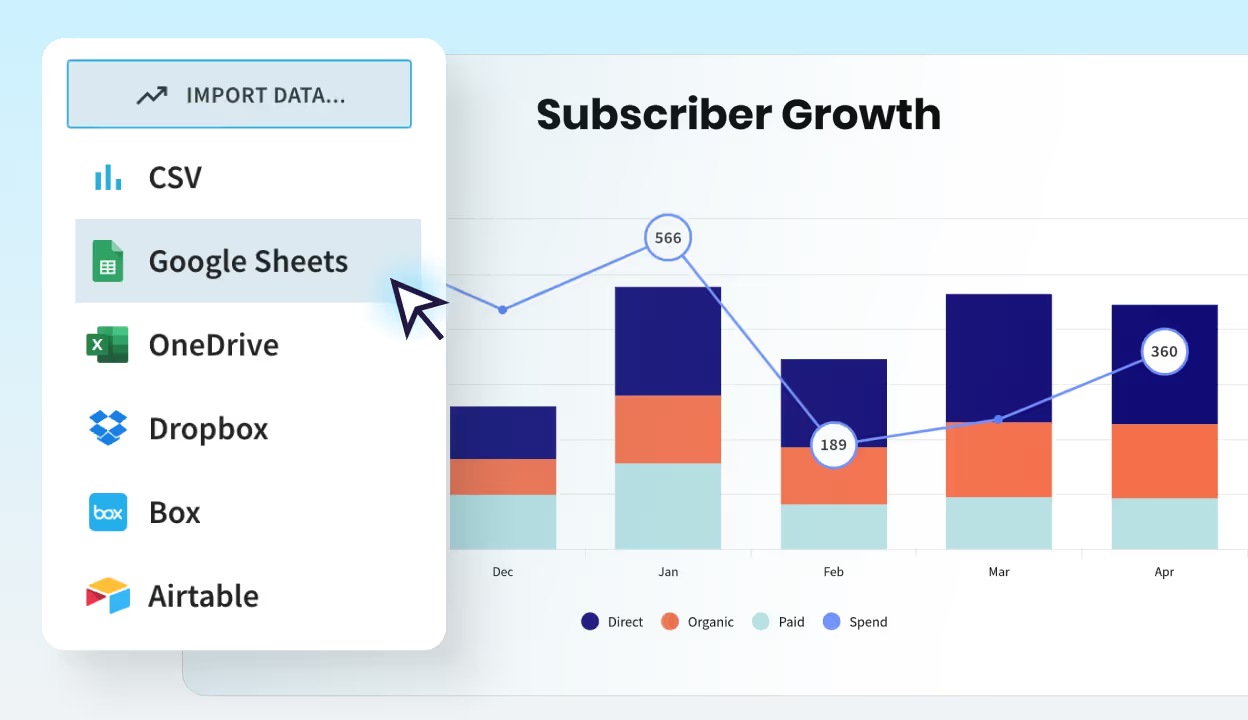
Connect data from CSV, Excel, or Sheets
Enable real-time updates by linking data sources. Great for dynamic presentations or frequently changing metrics.
Pick the perfect
Smart Slide for your data
Choose from a variety of chart and data slides including: Line, bar, pie, waterfall, area, donut and many more.
See every layout auto-adjust
Each slide is smart, and designs with you. Layouts and numbers resize as you edit, color logic is automatically applied to your charts, and animations bring your content to life.
Edit numbers directly, too
Choose from a variety of chart and data slides including: Line, bar, pie, waterfall, area, donut and many more.
Add the perfect Smart Slide from our gallery
Smart Slides are pre-built layouts that automatically align and resize as you add and edit your content. Whatever presentation you’re creating, Smart Slides turn complex data into clear, polished visuals that make insights easy to understand.
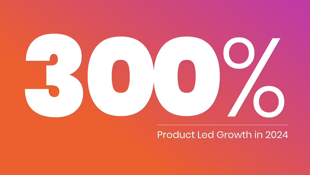
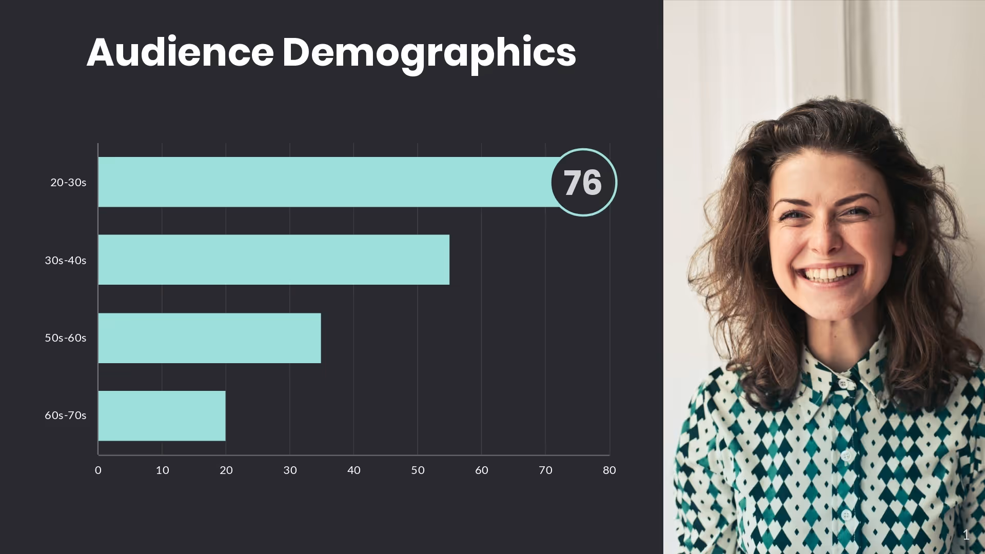
Big Number Slide
Spotlight a single KPI or headline metric

Data Dashboard
Compact set of mini-charts for overviews
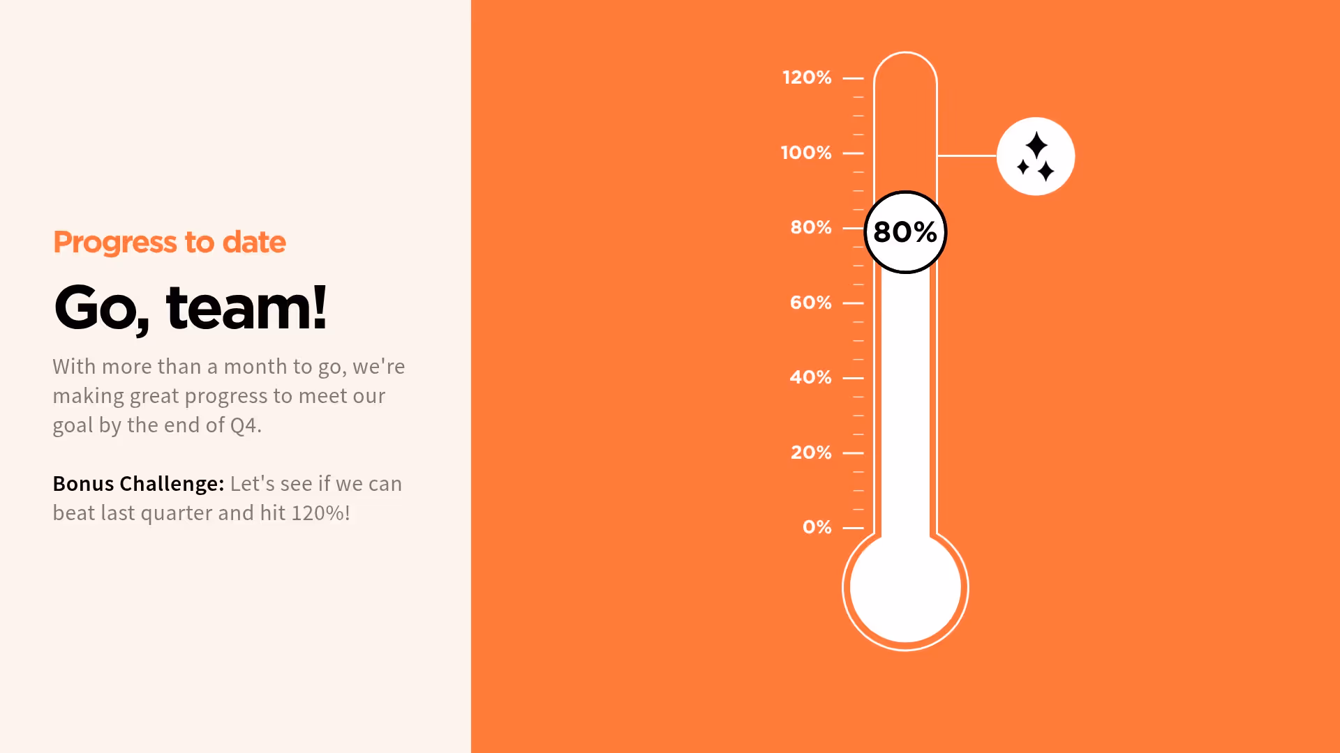
Thermometer Slide
Show progress toward a goal with a vertical animation
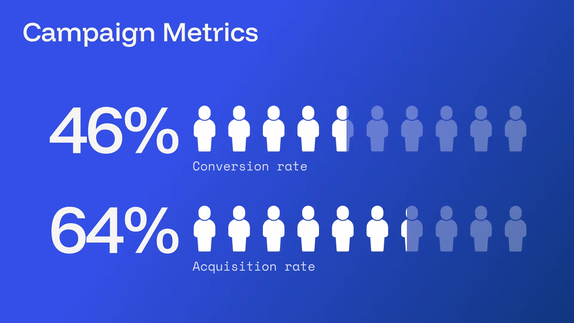
Percentage with Icons
Visualize percentages using icons
%20-%20Slide%209.avif)
Line Chart Slide
Measure trends over time
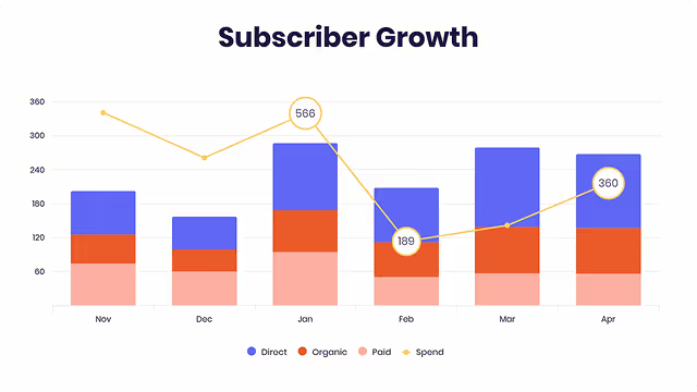
Column Chart Slide
Compare categories with vertical bars
Bar Chart Slide
Horizontal comparisons with labels
%20-%20Slide%2018.avif)
Waterfall Chart Slide
Explain stepwise increases in data
%20-%20Slide%2020.avif)
Area Chart Slide
Emphasize cumulative volume or trends
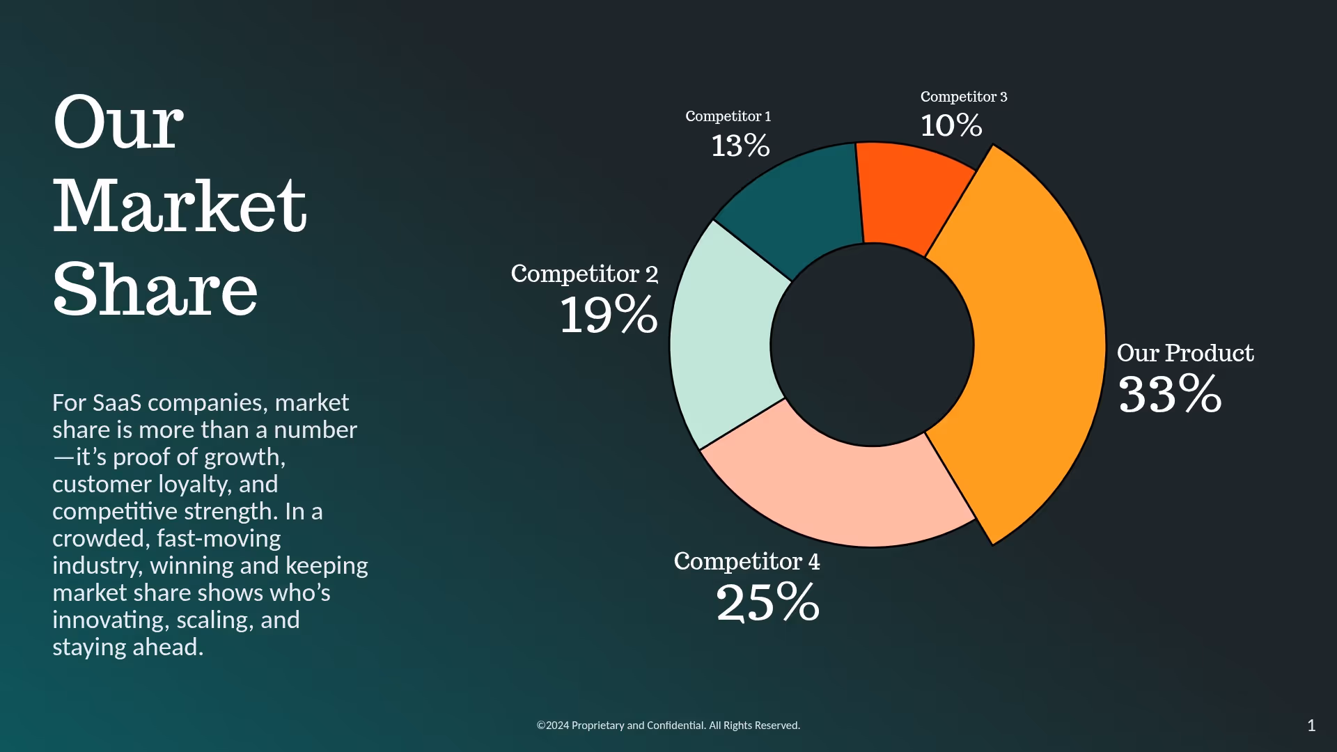
Pie Chart Slide
Simple breakdowns at a glance
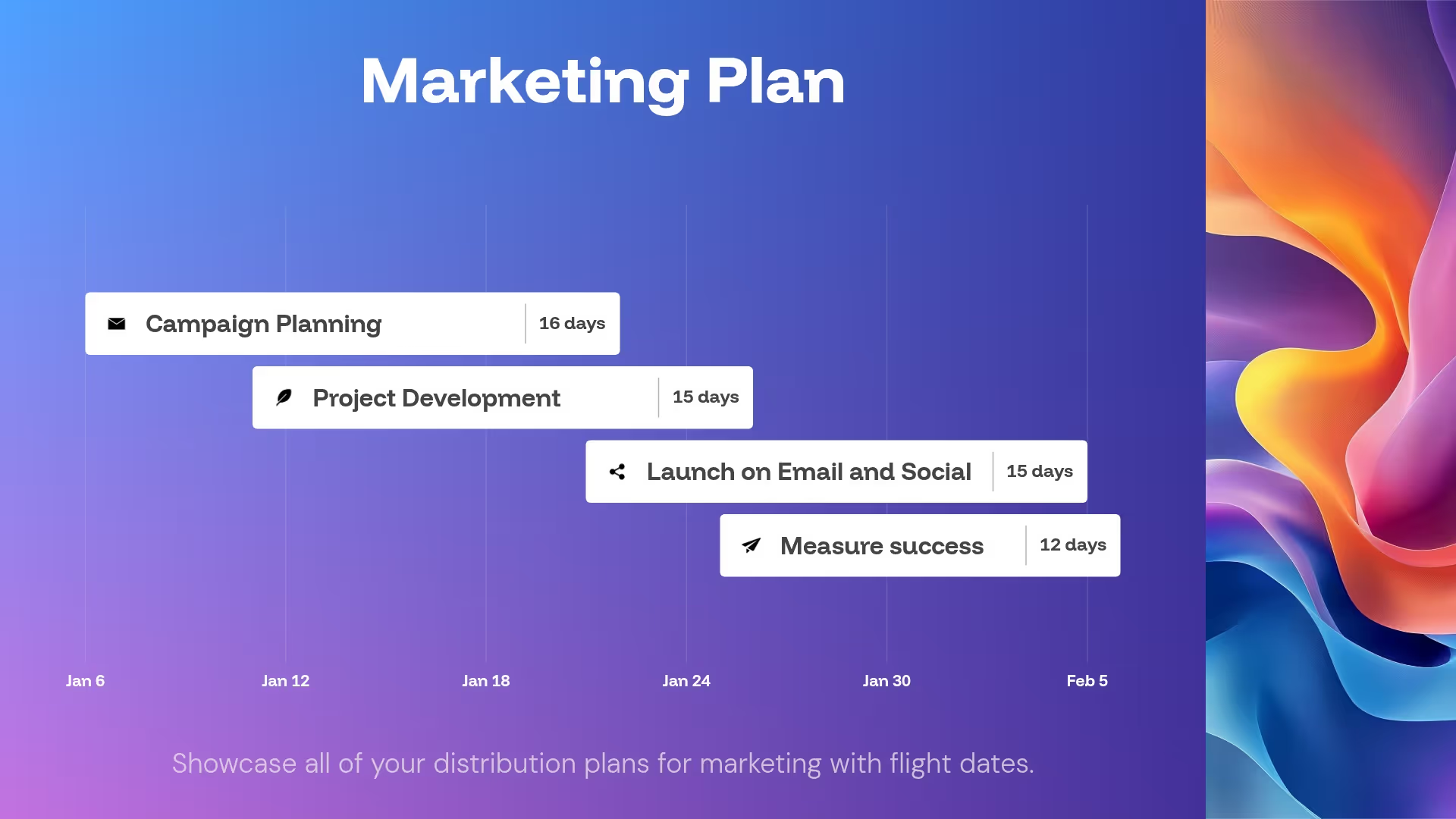
Gantt Chart Slide
Ideal for project planning or timelines
XY Plot Slide
Scatterplot to show relationships
Turn everyday decks into data-driven stories
Beautiful.ai helps you transform KPIs, trends, and results into polished visuals that tell a clear, compelling story in minutes.

"At IDC, we’re in the business of producing insight over data. We live in a world where the gap between data and insight has to be as short as possible. With the process that has Beautiful.ai at the very heart of it, we want to be days between data and insighy. The shorter that gap, the more valuable our data becomes.”

Hugh Ujhazy
Vice President of Research Technical Operations, IDC
“You have seven minutes of engagement time, that’s about the attention span of a human being before you have to re-engage either with a video or a story to bring them back. The animations of beautiful.ai are awesome. I use it for charts and graphs, and it certainly makes the presentation more engaging.”

Roger Lewis
CEO, CMIT Solutions
"I love all the options for presenting data, and love the fact that they animate on their own. Sure, you can go in and adjust the timing and cadence, but you’re already starting with something impressive.”

Renée Thorington
Senior Graphic Communication Specialist, MEMIC
Beautiful.ai helps you
present data with confidence
Save hours of time, while showcasing data that makes you look like a pro.
From data to deck, 10x faster
Stop wasting time wrestling with spreadsheets. Beautiful.ai helps you create professional, ready-to-share data visuals in a fraction of the time. Less busywork, more storytelling.

Turn data into insight, not noise
Transform raw numbers into visuals that clarify, not confuse. With Smart Slides, your charts and graphs instantly take shape — clean, professional, and purpose-built to tell a story.
Link and update data effortlessly
Beautiful.ai connects directly to your CSV, Excel, or Google Sheets, so charts refresh in real time. Skip the copy-paste grind, your slides stay up to date automatically.
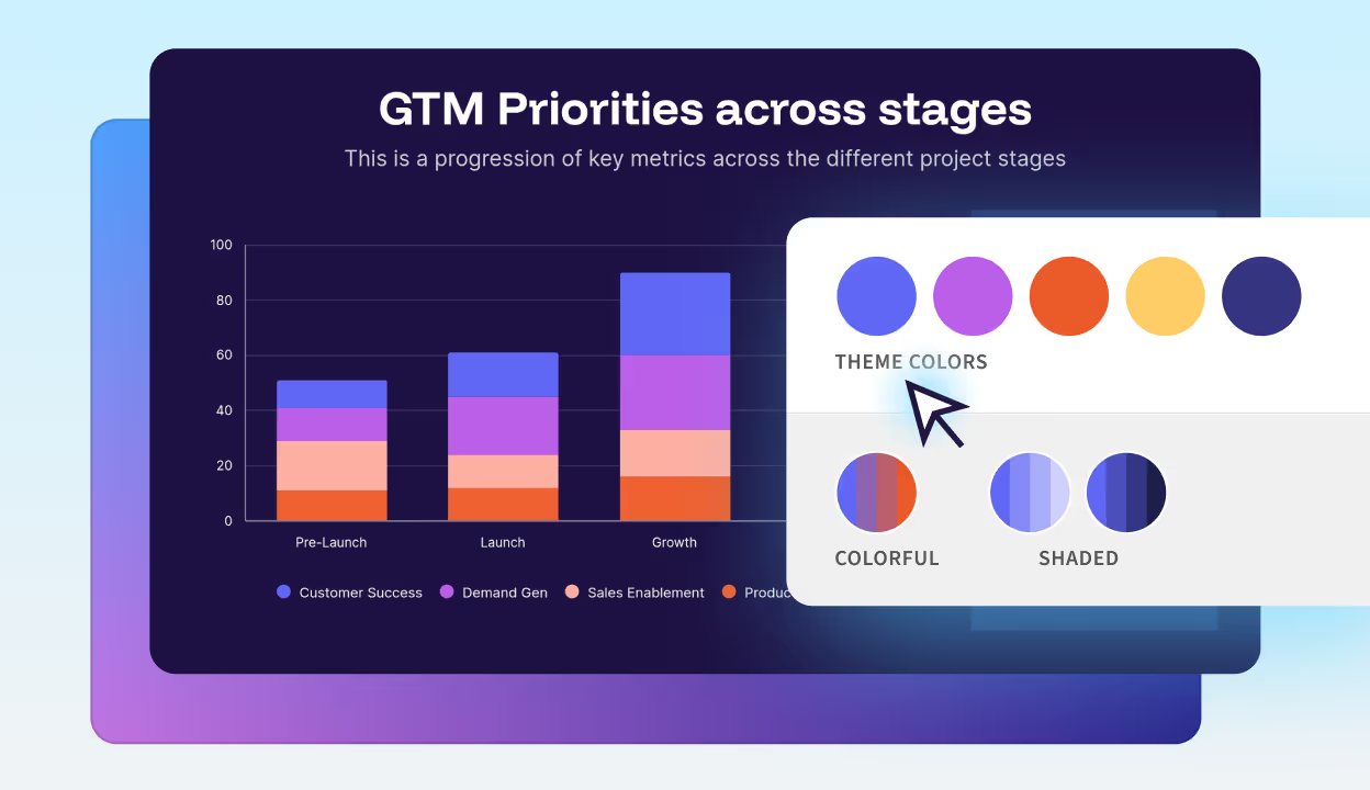
Always polished, always on-brand
Colors, fonts, and animation logic adapt automatically to your theme. The result? Charts that are perfectly on-brand, every time.
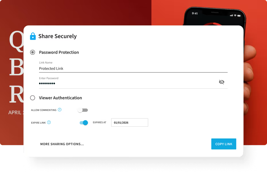
Share securely
With Beautiful.ai’s built-in player, you decide how every deck is viewed. Share a private link, apply password protection, or embed your deck on approved domains. Enterprise-grade permissions, domain whitelisting, and download restrictions keep sensitive data safe.


The complete presentation toolkit for beautiful storytelling
Generate ideas with AI, build visuals with Smart Slides, animate your data, and track engagement — all within the Beautiful.ai platform.
Inspiration gallery
Explore hundreds of Smart Slide layouts by category to jumpstart ideas.
Live chart previews
Instantly see how your data will look in real time as you edit.
Data animations
Make numbers move with smooth transitions that highlight key insights.
Smart Slides
Auto-align, auto-resize, and animate your content as you edit. Focus on the message, not formatting.
Create with AI
Kickstart your ideas with AI. Just enter a prompt, extra context too, and get a draft in seconds.
Themes & brand
Define colors, fonts, logos, icons, and footers once. Save and reuse brand themes.
Image libraries
Get direct access to an expansive library of free real-life stock images, and videos, no need to break your flow.
Viewer analytics
Control access, and track engagement so you know what resonates, and when to follow up
Animation & narration
Add embedded voice or video context to any slide - so your message lands clearly even when async.


Frequently asked questions about AI data visualization
AI-powered data visualization lets you transform raw data into charts, graphs, and visual representations. With platforms like Beautiful.ai, teams can create presentation-ready visuals without technical expertise. AI handles the formatting so you can focus on telling your data story — turning raw numbers into automated data storytelling that makes your insights impossible to ignore.
Yes. Beautiful.ai integrates directly with CSV files, Microsoft Excel, and Google Sheets. Once connected, your charts and graphs update automatically when your source data changes. This is ideal for presentations with frequently changing metrics, recurring reports, or live dashboards where you need current information without manual updates. Real-time data connection eliminates the tedious copy-paste cycle and ensures your presentations always reflect the latest numbers. Explore all available integrations to connect your favorite tools.
When your metrics change, you can refresh your charts within Beautiful.ai to automatically update the data — perfect for dynamic presentations, recurring reports, and live stakeholder meetings. No more copying and pasting numbers or rebuilding charts from scratch every time your data updates.
No design skills required. Beautiful.ai's Smart Slides handle all formatting automatically. As you add or edit data, layouts adjust, colors apply logically, and elements align perfectly. The AI ensures your visualizations look professional without any manual design work. This makes Beautiful.ai accessible to marketers, salespeople, executives, and anyone who needs to present data — not just designers or data analysts. You focus on the insights; the platform handles the aesthetics.
Absolutely. Beautiful.ai democratizes data visualization by removing technical barriers. There's no coding, no complex queries, and no steep learning curve. Team members simply upload or connect their data, choose a Smart Slide, and the AI creates a polished visualization automatically. This empowers marketing, sales, HR, and operations teams to create data-driven presentations without depending on data analysts or designers. Everyone in your organization can communicate with data effectively.
Yes. Beautiful.ai offers robust brand controls where you can define your color palette, fonts, logos, and footer styles. Once saved as a theme, every data visualization you create automatically inherits your brand settings.
Brand customization options for data charts and graphs
Customization options include: color palettes for charts and backgrounds, primary and secondary font families, company logos and positioning, footer text and slide numbering, and default animation styles.
Maintaining visual consistency across enterprise teams
Charts, graphs, and dashboards stay visually consistent across all presentations — critical for enterprise teams and client-facing decks. Centralized brand controls ensure every team member produces on-brand visualizations without manual oversight.
AI data visualization offers significant advantages over manual methods:
- Speed — What takes hours in traditional tools takes minutes with AI. What used to require a designer and a data analyst now happens automatically.
- Accuracy — Reduce errors by automatically formatting and aligning elements correctly.
- Automatic updates — AI-powered tools like Beautiful.ai keep visualizations updated when source data changes, eliminating repetitive manual work and freeing your team to focus on insights rather than formatting.
See our pricing to get started.
Beautiful.ai's AI visualization tool for presentations helps teams across every department transform KPIs, trends, and results into polished visuals that communicate insights clearly and drive action. Here are the most common use cases:
Marketing dashboards
Visualize campaign performance, growth KPIs, audience metrics, and ROI data. Show stakeholders exactly how marketing efforts translate to results.
Sales reports
Track quarterly targets, conversion rates, pipeline data, and win/loss analysis. Give sales leaders the visual clarity they need to make strategic decisions.
Investor decks
Present market opportunities, growth milestones, financial projections, and competitive positioning. Make your data tell a compelling investment story.
Product updates
Share roadmaps, user analytics, feature adoption data, and development progress. Keep cross-functional teams aligned with clear visual communication.
Team metrics
Communicate performance goals, OKRs, and departmental KPIs internally. Drive accountability with transparent, visually engaging progress reports.
Connect directly to CSV, Excel, or Google Sheets and never manually update a chart again. When your source data changes, your visualizations refresh automatically. This real-time connection eliminates repetitive work and ensures your presentations always reflect current information. It's perfect for dynamic presentations, recurring reports, and live stakeholder meetings. No more copying and pasting numbers or rebuilding charts from scratch every time your data updates. Beautiful.ai also integrates with tools like Slack, Dropbox, and Webex to streamline your entire workflow. Explore all available integrations.
With Beautiful.ai's built-in player, you decide how every deck is viewed. Enterprise-grade permissions, domain whitelisting, and download restrictions keep sensitive data safe. Security and sharing features include:
- Private/Public Links — Share decks via secure private or public links based on your audience needs
- Password Protection — Add password protection to sensitive presentations containing confidential data
- Email Verification — Require email verification before granting access to ensure only intended recipients view your content
- Link Expiration — Set automatic link expiration dates for time-sensitive presentations
- Enterprise Permissions — Role-based access controls for teams ensure the right people have the right level of access
Download Restrictions — Control who can download your presentations to protect proprietary information
Beautiful.ai combines AI-powered design with data visualization through Smart Slides. When you input data, the platform automatically formats charts, applies color logic, adjusts layouts, and adds animations.
How AI-powered Smart Slides automate chart design
You don't need to manually resize elements or choose color schemes — the AI handles design decisions so you can focus on your message. Whether you're tracking trends over time or comparing categories, there's a Smart Slide designed for your specific use case. Beautiful.ai also suggests optimal chart types based on your data and presentation goals, ensuring your visualizations communicate effectively every time. The AI presentation maker can even generate complete slide drafts from simple text prompts. No coding required. No design skills needed.
Beautiful.ai offers a comprehensive library of data visualization Smart Slides. Browse our slide templates to see all available options, including:
- Line charts for tracking trends over time
- Bar and column charts for category comparisons
- Pie and donut charts for proportional breakdowns
- Waterfall charts for stepwise data changes
- Area charts for cumulative volume visualization
- Gantt charts for project timelines and roadmaps
- XY scatter plots for correlation analysis
- Big number slides for highlighting key KPIs
- Data dashboards for executive overviews
- Thermometer slides for goal tracking
Each slide type is fully customizable while maintaining automatic design alignment.
Traditional business intelligence tools like Tableau and Power BI are built for deep data analysis and creating operational dashboards. Beautiful.ai is purpose-built for presentations and reporting & analytics.
Key differences between BI tools and presentation-focused AI visualization
Purpose: BI tools focus on data exploration; Beautiful.ai focuses on data storytelling and audience communication. Output: BI tools create dashboards; Beautiful.ai creates polished, presentation-ready slides. Design: BI tools require manual formatting; Beautiful.ai auto-designs with Smart Slides. Features: Beautiful.ai includes animations, narration, and brand controls built for presenting. Audience: BI tools serve analysts; Beautiful.ai serves anyone who presents data to stakeholders.
When to choose Beautiful.ai over traditional BI software
If your goal is presenting data to clients, executives, or external stakeholders — rather than exploring data internally — an AI data visualization tool for presentations like Beautiful.ai delivers presentation-ready output that BI tools don't provide. It bridges the gap between raw analysis and compelling visual communication. For teams already using tools like PowerPoint for final delivery, Beautiful.ai's PowerPoint integration makes the transition seamless.
Smart Slides are AI-powered templates that automatically adjust as you add content. For data visualization specifically, Smart Slides handle chart formatting, number placement, legend positioning, and color assignment based on your data values. When you update a data point, the entire slide rebalances automatically. Smart Slides also include built-in animations that reveal data progressively, helping you control the narrative flow during presentations and keep your audience engaged throughout. View our presentation templates to see Smart Slides in action.
Yes. Beautiful.ai offers enterprise-grade features designed for organizations that need to scale data storytelling while maintaining security and consistency. Enterprise plans include team workspaces, centralized brand controls, viewer analytics, role-based permissions, SSO integration, and secure sharing options like password protection and domain whitelisting. Whether you have ten people or ten thousand, this AI data visualization software scales with presentation workflows that keep teams aligned and productive.
Yes. Beautiful.ai includes automatic data animations that bring your charts to life during presentations. Numbers count up, bars grow, and pie segments reveal progressively. These animations help guide your audience's attention and make data presentations more engaging and memorable. You can also adjust animation timing and sequence to match your presentation flow and storytelling rhythm. Whether you're building startup pitches or training materials, animations make your data impossible to ignore.
Beautiful.ai lets you go from data to deck 10x faster than traditional tools. Skip the manual formatting that consumes hours of your workday — AI-powered visualization creates presentation-ready charts in seconds, not hours. What used to require a designer and a data analyst now happens automatically. Raw numbers overwhelm audiences, but Smart Slides transform complex datasets into clear, professional visuals that tell a story your audience understands immediately. Beautiful.ai ensures your data communicates — not confuses. Start a free trial and see the difference.
Colors, fonts, and animations adapt to your theme automatically. Every chart, graph, and data slide stays perfectly on-brand without manual adjustment. Consistency across presentations builds credibility and reinforces your professional image. Save your brand settings once as a reusable theme — including color palettes, font families, logos, footers, and animation styles — and every visualization your team creates will automatically inherit those settings. For individual users, brand themes ensure every deck looks polished. For enterprise teams, centralized brand guardrails keep everyone aligned at scale.
Beautiful.ai provides a complete AI presentation toolkit for data storytelling. Here's what's included in order of most-used features:
- AI-Powered Smart Slides — Auto-align, auto-resize, and animate content as you work, so you focus on your message while AI handles the design
- Live Chart Preview — See exactly how your data looks in real-time as you edit, with no surprises when you present
- AI Presentation Generator — Generate complete presentation drafts instantly from a simple text prompt — describe what you need and let AI build your starting point
- Automated Data Animations — Smooth, automatic transitions highlight key insights and guide your audience's attention through the data story
- Brand Themes — Save colors, fonts, logos, and footers as reusable themes for consistent branding across every presentation
- Stock Image Library — Access millions of free stock images and videos without leaving the platform
- Viewer Analytics — Track who viewed your presentation, how long they engaged, and which slides captured attention
- Smart Slide Inspiration Gallery — Browse hundreds of Smart Slide layouts organized by category to jumpstart your data presentations and spark creative ideas
- Animation & Narration — Add voice recordings or video to slides for effective async communication
How the toolkit supports end-to-end data storytelling
From initial idea generation through final audience engagement tracking, Beautiful.ai's toolkit covers every stage of the presentation workflow. Teams can ideate with AI, build with Smart Slides, polish with brand themes and animations, and measure impact with viewer analytics — all without leaving a single platform.
For tips on maximizing your data storytelling workflow, explore our data visualization blog.
Scaling presentation workflows across teams
For organizations managing multiple teams and recurring presentations, the toolkit's combination of brand themes, Smart Slides, and viewer analytics creates a scalable, repeatable workflow. Every team member produces consistent, on-brand data visualizations without bottlenecks from design or data teams. Learn how to automate your weekly reports with Beautiful.ai.

Discover a faster way to create stunning presentations.
Work smart, work simple, work beautiful.
