.jpg)


When you don’t know where to take your presentation, Smart Slide templates are a great starting point. The customizable templates use guardrails to protect the design as you add in your content, and can help you reimagine your story. While there are intentional limitations to maintain design integrity, there are so many different ways to customize each layout beyond the default settings.
In this series, we’re highlighting your favorite slide templates, and challenging you to try something new. For each Smart Slide, we’ll showcase different ways to style and format it to help inspire a new way to tell your story.
Bullet slide
A bullet slide has a bad reputation. When someone doesn’t know how to structure their content, a bulleted list is a familiar, comfortable, safe option. We get it— it’s easy to organize your thoughts on a bullet slide with little design or creativity lift.
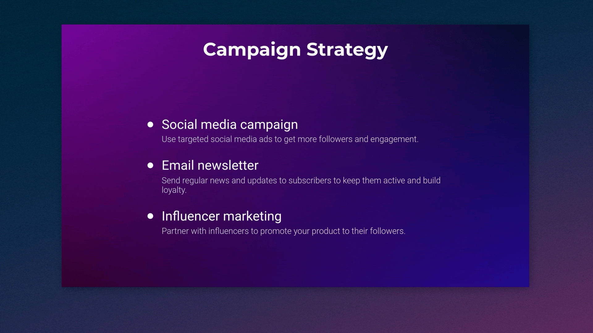
No one likes to read long, solid blocks of text, especially in a presentation. To avoid a lengthy text dump you can use Beautiful.ai’s bullet slide to organize content into a list form, to show that certain items belong together, or to summarize key information in your presentation. This makes an otherwise text-heavy slide more digestible, and less overwhelming to the audience.
Bullet slide design tips
A simple bullet list can work wonders for the text in your presentation, but it can also be boring. Here are five ways you can design your bullet slide for more visual appeal.
Try different bullet styles
In Beautiful.ai you can toggle between different variations of a slide to see what style looks best with your content. For a bullet slide, you can switch between bullets, numbers, stars, or checks and x’s. Depending on your content, you might use these different variations for a pros and cons list, the steps of a process, or to summarize separate ideas under one topic.
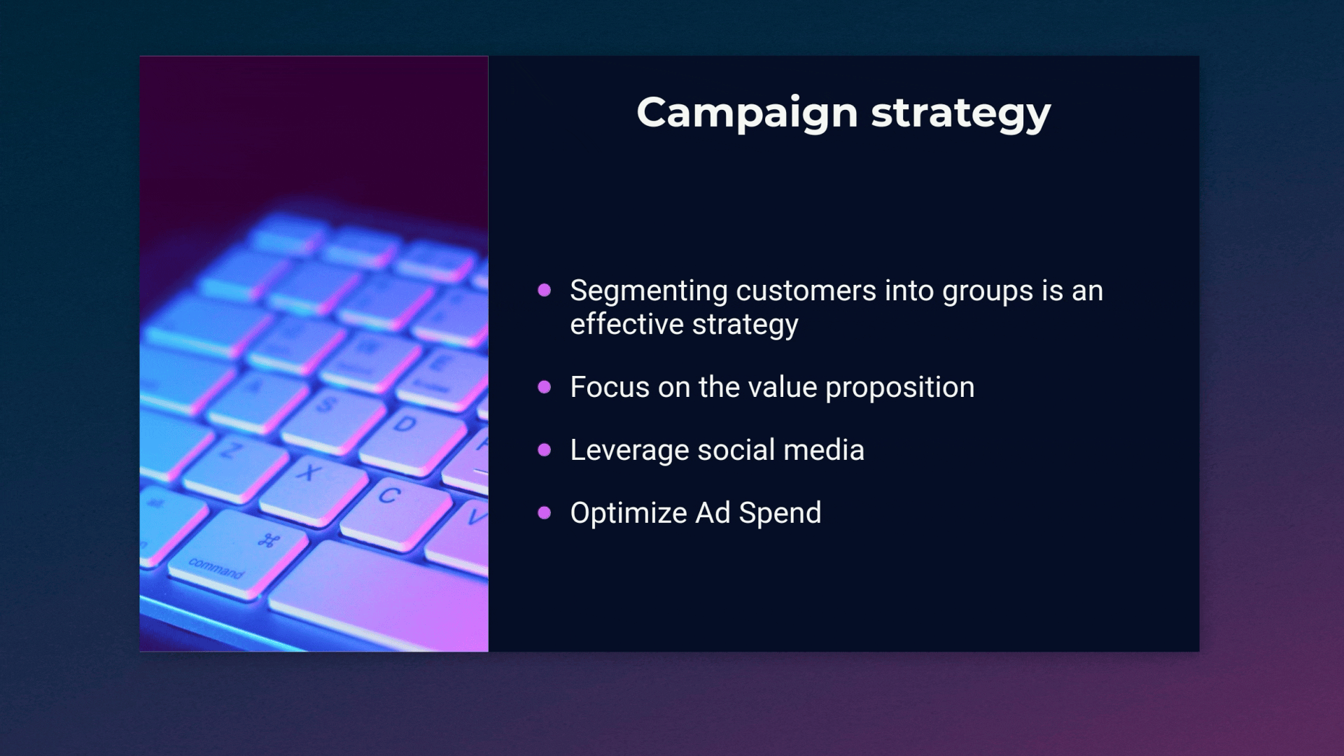
Add a supporting visual in a sidebar
For a more engaging design, you can opt for a sidebar on either side of your bullet slide. The sidebar is fully customizable, and can house video, image(s), text, or a combination of all three. By adding a sidebar with a supporting visual, you’re encouraging your audience to focus on the slide and retain the information within your chart.
Organize your content in columns
Bullet slides have a lot of text by nature, which can be overwhelming for your audience to understand at a glance. Organizing your content in columns can be easier to follow, and therefore more digestible. How you choose to structure your columns depends on your story, but they work well for chronological content or a list of pros and cons.
Create dimension with a background image
A bulleted list can fall flat if you rely simply on text. To keep your audience engaged, you can take more creative control of the slide background. To add some dimension to the slide, you might try an image or textured, gradient background. Just make sure you keep legibility in mind so your slide doesn’t go from boring to cluttered.
Try icons with text for bigger impact
A close relative of the bullet list is our icons with text Smart Slide. While it still allows you to list out information, you can do so with a supporting image or icon for more visual impact. With our icon slide template, you can pair images to text, helping your audience process information easier.
Toggling between different slides is a low-stakes way to visualize your content in new ways without having to start over from scratch.

.gif)


